
Show me the Data!
In the science world, no one will care about the work you’ve done, until they see it!
Visualizing your data is essential to making your research effective not only in the science community but, more importantly, in the eyes of the public. We are visual creatures; so, we are more apt to pay attention to something when it’s brightly colored, easy to read, and grabs our attention!
…why do you think info-graphics are so popular!
How do you choose the right graph?
Although there are hundreds of graphs to choose from, here we’ve just stuck to some of the most popular and easy to read graphs. The most effective graphs for your data depend on what you’re trying to do with your data…

Ask yourself…
“What am I trying to show?”
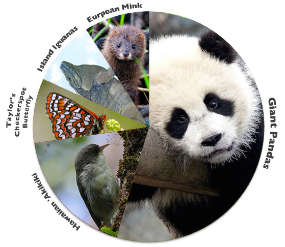
1) I need to show the composition of something
Popular Option: Pie Chart
If you have data that makes up portions of one large whole, a pie chart can be an extremely effective tool to communicate what you want. For instance, if collected data on where a squirrel spends it’s time during the day, each activity makes up a small percentage of the squirrel’s whole day.

2) I need to show the comparison of multiple things
Popular Option: Bar Graph or Clustered Bar Graph
If you need to compare multiple variables over similar events, you have the option of using a few bar graphs, or you can use what’s called a clustered bar graph that places the each variable on the same chart for comparison.
For example, from our 2018 publication, we compared the feeding processes of wild vs captive bred pandas to show that captive‐born pandas devoted less time and effort to handling and chewing leaves and chose to consume more of the large culms than the wild-born pandas:

Having your data side by side like this allows for an easy visual comparison as opposed to having two graphs that you would have to closely analyze to determine the differences. You can, of course, have more than two independent variables on a clustered bar graph; however, if you start getting too many, it’s best to move to a stacked bar graph, to keep things a little cleaner and more visually appealing.
2) I need to show the change in something over time
Popular Option: Line Graph
If you collected data that changes over a time period, one of the best way to visualize trends is plotting it on a line graph. Just like with the clustered bar graph, you can plot several different variables on line graph together to help delineate the differences of multiple variables over time.
For instance, the San Diego Zoo plotted the growth of several different panda cubs using a plotted line graph:

3) I have a lot of data, but I don’t know where to start
Popular Option: Scatter Plot
When you have a massive amount of data and want to view it visually, scatter plots can be very revealing when it comes to trends, distribution, and outliers.
For instance, in the scatter plot of Old Faithful Geyser Eruptions below, you can not only tell that there is a definite correlation between the duration of Old Faithful’s eruptions and the waiting time between each eruption, but that there is a distinct missing portion in the center. This would indicate Old Faithful has two different kinds of eruption patterns. Trends like these may get missed if it was graphed simply in a line.

Sometimes it can be helpful to start with a scatter plot to determine data patterns, and then use another kind of graph if you want to emphasize a portion of the data’s tend.
4) I have a lot of different kinds of data
Popular Option: Mixed Graphs
Sometimes, you realize different portions of your data are best visualized with different graphs, but having each separate doesn’t tell the whole story of your results. In this instance, it can be extremely powerful to use a mixed graph to provide a succinct, effective summary of your project’s findings.
For instance, in the mixed graph below from our 2017 publication, we used a stacked bar graph in conjunction with a line graph to indicate how female panda breeding success fluctuates in relation to the use of different breeding techniques. This, in effect, allowed us to help demonstrate the effectiveness and prevalence of each breeding technique over time.

5) Key things to think about
When you’re first analyzing you data, the best graph may not always just pop out, but the more you play around with different styles the quicker you’ll realize what looks best. There are; however, a few key things to remember when displaying your graphs:
Key Factors for Effective Graphs
- Clear axis labels, legends, and titles: Graphs are not the place to become creative with titles. Try to make every label as clear, concise, and simple as possible.
- Less is More: White space on a graph is very visually appealing and can draw more attention to the portions of the graph that indicate results. Clear as many graph lines and unnecessary points as possible, and make sure there are no redundancies in your labeling.
- Effective Coloring: You want your graphs to catch the eyes of your audience (unless your graph is in a publication, then other rules apply). That being said, you want it to capture them in a good way…not in a tie-dye, cheetah-print, hot pink stiletto kind of way. Keep your colors complementary and use either white or grey to accent the back of your graph.
- Utilize Feedback: Finally, don’t be afraid to ask for feedback and welcome any constructive criticisms. Anyone else looking at your graphs is typically looking at them for the first time, so if something doesn’t make sense to them…it probably won’t make sense to the majority of people. This goes back to the old saying “two pairs of eye are always better than one”.
PDXWildlife Team